Showing posts with label downgrades. Show all posts

18 September 2007

Uniforms through the years--downgrades part 2

Now, for the top 5 worst uniform changes in history. You may notice that some teams are not on here. For example, the San Diego Padres have always been infamous for having ugly uni's, so you can't really say they got worse. These, however, are examples of uniforms that were kinda OK, or even cool, but took a severe downturn.


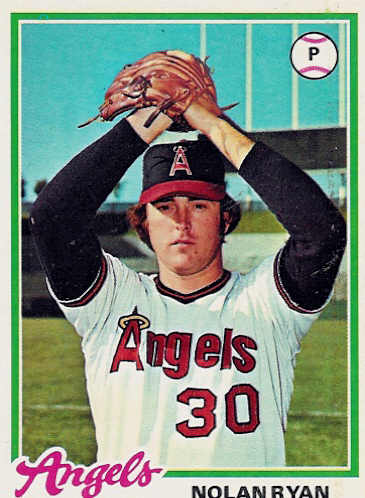
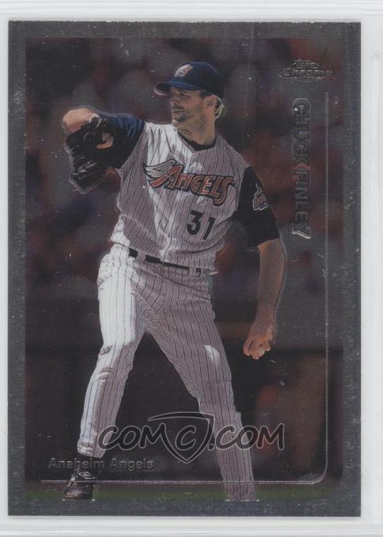
5) Los Angeles/California/Anaheim/Los Angeles/LA Angels (of Anaheim)

A team that has changed names as often as they change their look. And this change, when they went to the Disneyland look...not good. Not good at all. (If an Angels fan can help me out on the chronology of their uni's. I'm not quite sure if I have it right.)


4) Philadelphia Phillies

They go from the maroon stripes, and blue road uni's to...zzzzzz


3) Buffalo Sabres

How do my beloved Sabres go to something that looks like, as one fan put it, a slug?


2) New York Islanders

They go from winning 3 straight Lord Stanleys to being walking billboards for Gorton fish sticks. Ugh.


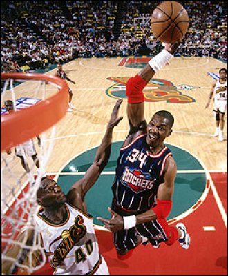
1) Houston Rockets

Boy, it was a toss-up. But, a year after winning their 2nd straight title, they go to an ugly blue pinstripe with a grimacing rocket in orbit. And the floor they played on suffered as well. All in all, the worst change in any sport, ever.

17 September 2007

Uniforms through the years--downgrades part 1

Sometimes, a team doesnt know when to leave well enough alone, and change uni's just...because. These are some examples of teams that (a) should have left their uni's alone or (b) that's the best they could come up with? Starting with the 10th worst "downgrade":


10) Baltimore Orioles

They went from the cool "bird" design to...eh.


9) Vancouver Canucks

From the "skate in motion" to a crappy-looking "Orca" coming out of the "C".


8) Houston Astros

It was bad enough they ditched the "rainbow" jerseys. They then went from the kinda OK design on the left to the snoozer on the right.


7) Cincinatti Bengals

After performing one of the classic upgrades in the history of sports apparel, they changed into some circus-looking things.


6) New York (football) Giants

It was bad enough they changed into some dingy-looking grey pants, but then they went back to the lower-case "ny", from the more imposing all-capital "GIANTS".