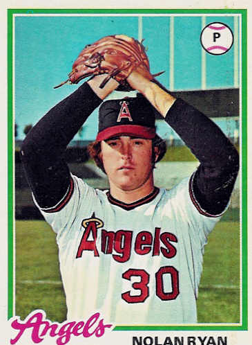
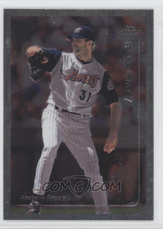
5) Los Angeles/California/Anaheim/Los Angeles/LA Angels (of Anaheim)
A team that has changed names as often as they change their look. And this change, when they went to the Disneyland look...not good. Not good at all. (If an Angels fan can help me out on the chronology of their uni's. I'm not quite sure if I have it right.)
4) Philadelphia Phillies
They go from the maroon stripes, and blue road uni's to...zzzzzz


3) Buffalo Sabres
How do my beloved Sabres go to something that looks like, as one fan put it, a slug?


2) New York Islanders
They go from winning 3 straight Lord Stanleys to being walking billboards for Gorton fish sticks. Ugh.


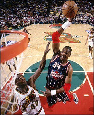
1) Houston Rockets
Boy, it was a toss-up. But, a year after winning their 2nd straight title, they go to an ugly blue pinstripe with a grimacing rocket in orbit. And the floor they played on suffered as well. All in all, the worst change in any sport, ever.