Showing posts with label Uniforms through the years. Show all posts

22 September 2007

Uniforms through the years--upgrades

These are the best changes to any uniforms in the history of sports. Some are good, some are classic, some--you might say--have brought world championships to their teams. These are the changes that made people say, "Wow! I gotta get me one of them!!" Starting with #10--


10) Seattle Mariners

The new look is cleaner, sharper, and more professional looking than the late-80's type.


9) Milwaukee Brewers

The ball-and-glove design on the cap and the home pinstripes were a step-up from the double-A farm team look. OK, maybe everybody didn't jump up to get one. But it was definitely a step up.


8) Philadelphia 76ers

This was a definite improvement from two previous changes that can only be described as "Whose bright idea was that!!"


7) Chicago White Sox

When in doubt, go back to the future. When the ChiSox went back to one of their older uni's, they found a look that has endured for years, and should remain for years to come.


6) Cleveland Cavaliers

When you draft a player who is supposed to be the future of your franchise, you need to upgrade your look. Which is what the Cavs did with the "champagne and burgundy" look.


5) San Diego Chargers

For years, fans of the Bolts have been clamoring for them to go back to the white helmets. And although the new look should increase sales of merchandise, that doesn't seem to be translating to their results on the field. (Note for Norv Turner: You are no Marty Schottenheimer.)


4) Los Angeles Kings

When The Great One joins your club, you gotta make him look good. Another team that changed its colors for an arriving superstar. And two awful changes later, the coolness of these jerseys is even more apparent.


3) Cincinnati Bengals

It was very hard to put the top three in order. Because each one of these teams went to the Super Bowl the year they made these changes, with #1 and #2 winning the whole thing. That said, the Bengals made one of the most the radical changes in NFL history.


2) Denver Broncos

John Elway finally gets a ring!! The move away from the orange jerseys, the snarling horse on the helmet (that did kind of resemble Shannon Sharpe), and the newfangled numbers are one of the two best changes to any uniform in any sport. However, the #1 spot has to go to.....


1) Tampa Bay Buccaneers

Farewell Bucco Bruce, hello Jolly Roger! And, after years of being the "Yucks", the Bucs changed not only their design, but the team's colors as well.

18 September 2007

Uniforms through the years--downgrades part 2

Now, for the top 5 worst uniform changes in history. You may notice that some teams are not on here. For example, the San Diego Padres have always been infamous for having ugly uni's, so you can't really say they got worse. These, however, are examples of uniforms that were kinda OK, or even cool, but took a severe downturn.


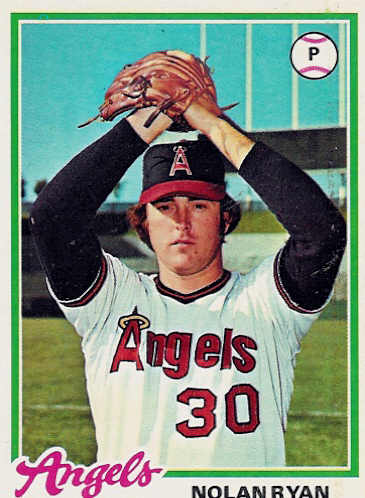
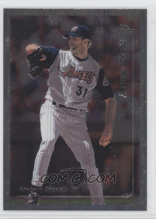
5) Los Angeles/California/Anaheim/Los Angeles/LA Angels (of Anaheim)

A team that has changed names as often as they change their look. And this change, when they went to the Disneyland look...not good. Not good at all. (If an Angels fan can help me out on the chronology of their uni's. I'm not quite sure if I have it right.)


4) Philadelphia Phillies

They go from the maroon stripes, and blue road uni's to...zzzzzz


3) Buffalo Sabres

How do my beloved Sabres go to something that looks like, as one fan put it, a slug?


2) New York Islanders

They go from winning 3 straight Lord Stanleys to being walking billboards for Gorton fish sticks. Ugh.


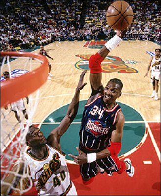
1) Houston Rockets

Boy, it was a toss-up. But, a year after winning their 2nd straight title, they go to an ugly blue pinstripe with a grimacing rocket in orbit. And the floor they played on suffered as well. All in all, the worst change in any sport, ever.

17 September 2007

Uniforms through the years--downgrades part 1

Sometimes, a team doesnt know when to leave well enough alone, and change uni's just...because. These are some examples of teams that (a) should have left their uni's alone or (b) that's the best they could come up with? Starting with the 10th worst "downgrade":


10) Baltimore Orioles

They went from the cool "bird" design to...eh.


9) Vancouver Canucks

From the "skate in motion" to a crappy-looking "Orca" coming out of the "C".


8) Houston Astros

It was bad enough they ditched the "rainbow" jerseys. They then went from the kinda OK design on the left to the snoozer on the right.


7) Cincinatti Bengals

After performing one of the classic upgrades in the history of sports apparel, they changed into some circus-looking things.


6) New York (football) Giants

It was bad enough they changed into some dingy-looking grey pants, but then they went back to the lower-case "ny", from the more imposing all-capital "GIANTS".

04 September 2007

Uniforms through the years--the best we'll never see again

There are some uni's that will never come back. Because of relocation, these teams have changed cities and/or nicknames. But they leave behind some of the best uniforms.


6) Winnipeg Jets


Now the Phoenix Coyotes. Which is odd, because coyotes have really a sharp sense of smell. However, even with The Great One at the helm, these coyotes haven't caught a whif of the playoffs in...dare I say...a dog's age.


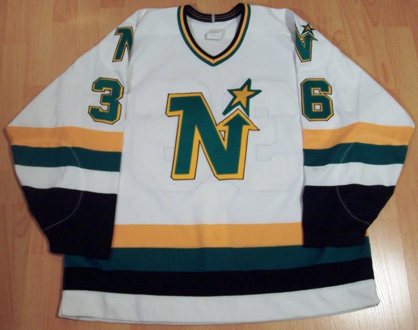
5) Minnesota North Stars


Now the Dallas Stars. Unlike the 'yotes, the Stars did not suffer a fashion downturn when they changed cities. Also, their on-ice fortunes changed for the better, winning the cup in 1999, thanks to Brett Hull having his foot clearly in the crease. But, no sour grapes. Nope, none at all. Even though he cheated. Anyway...


4) Houston Oilers


Now the Tennessee Titans. Went to the Super Bowl the year after changing name and uni's. Too bad there's no oil in Tennessee. They could have even brought back the silver helmets of the George Blanda Era.


3) Hartford Whalers


Now the Carolina Hurricanes. The old home jerseys before they put the silver in it. The "H" between the "W" and the fluke was ingenious. Another team that won the Cup after changing cities.


2) Washington Bullets


Now the Washington Wizzzzzards. This is a team that is in serious need of...everything. Not only can their uni's put you to sleep, but...watching them.......yawn....oh, sorry.

But the best uniforms we'll never see again belong to the...


1) Montreal Expos


The tri-color hats, the blue road uni's, the funky-looking "M", the shape of the numbers. This was one of the best-dressed teams in MLB during the '70's and early '80's. Now that they are the Washington Nationals--who aren't doing too awfully bad--we will never see these again. Unfortunately.

31 August 2007

Uniforms through the years--bring 'em back (part 2)

Part 2 of "Uniforms they need to bring back." Again, these are in no particular order, but they should be brought back to breathe life into the landscape of boring--or just plain bad--jerseys.

Pittsburgh Pirates


Buffalo Sabres


Baltimore Orioles


Anaheim Mighty Ducks


Houston Astros


Oakland Athletics